Dashboard Design for TrashBot
Problem
Large commercial facilities, like airports and office buildings, spend enormous amounts of time and money on waste management. TrashBot, by CleanRobotics, is a smart waste container that automates recycling and generates data needed by these organizations.
Despite their innovative hardware, they were still missing a key piece of software: a dashboard for customers to access their waste data.
Solution
I designed a web app dashboard which helps CleanRobotics' customers analyze their waste data and streamline waste pickup.
Role
Freelance UX / UI Designer
ROLE
Freelance UX / UI Designer
SKILLS
UX/UI Design Data Visualization
CLIENT
Client
Background
Waste disposal is a huge headache.
When was the last time you were in an airport?
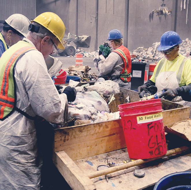
Chances are you threw something away, like millions of other people, without a second thought. However, the airport's facility is on the hook to carefully track and manage all the waste to make sure it's all going to the right place. This translates into metric tons of work for these types of facilities, whether they're conference centers, stadiums or your own office.
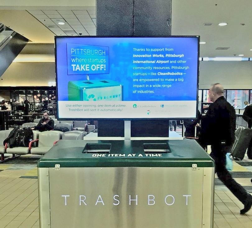
TrashBot to the rescue.
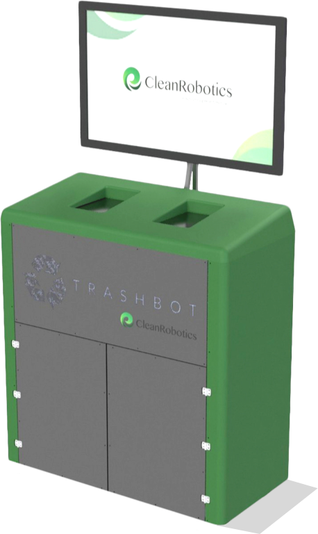
TrashBot automatically sorts waste at the point of disposal. Under the hood, it uses computer vision, sensors, and actuators to identify and sort waste. It can tell the difference between a can of Coca Cola and a candy wrapper, tagging and sorting them appropriately.
How does TrashBot work?
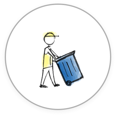
Dispose
TrashBots are placed around a building, just like a normal trashcan.
Sort
Sensors inside TrashBot sort items into bins, pushing waste data to the cloud.
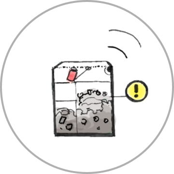
Notify
TrashBot alerts custodians when a bin gets full, saving time checking bins.
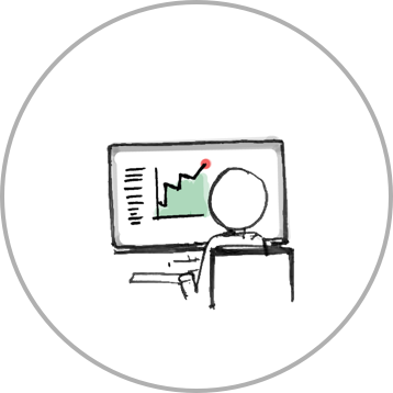
Report
TrashBot's waste data can be visualized and plugged directly into waste audits.
Product Features
That last step - reporting and analytics - is where I came in. The team had built some snazzy hardware, but a customer still couldn't access any of the waste data that TrashBot was collecting.
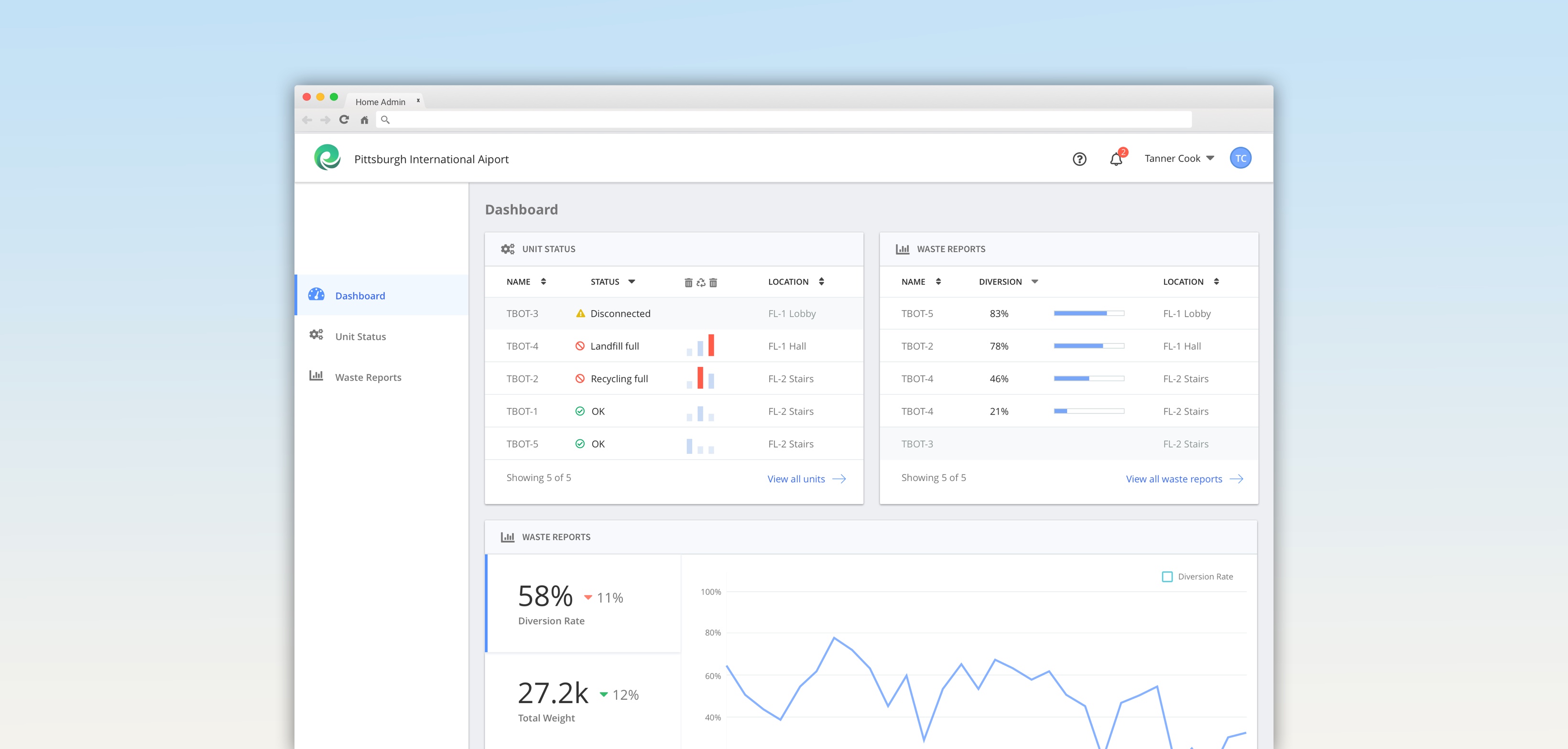
Dashboard
Users can view operational alerts and KPIs across their building and organization.
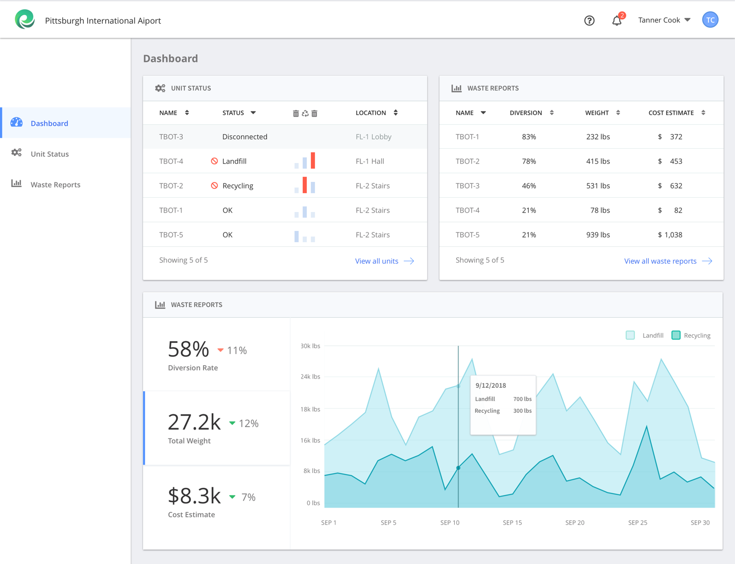
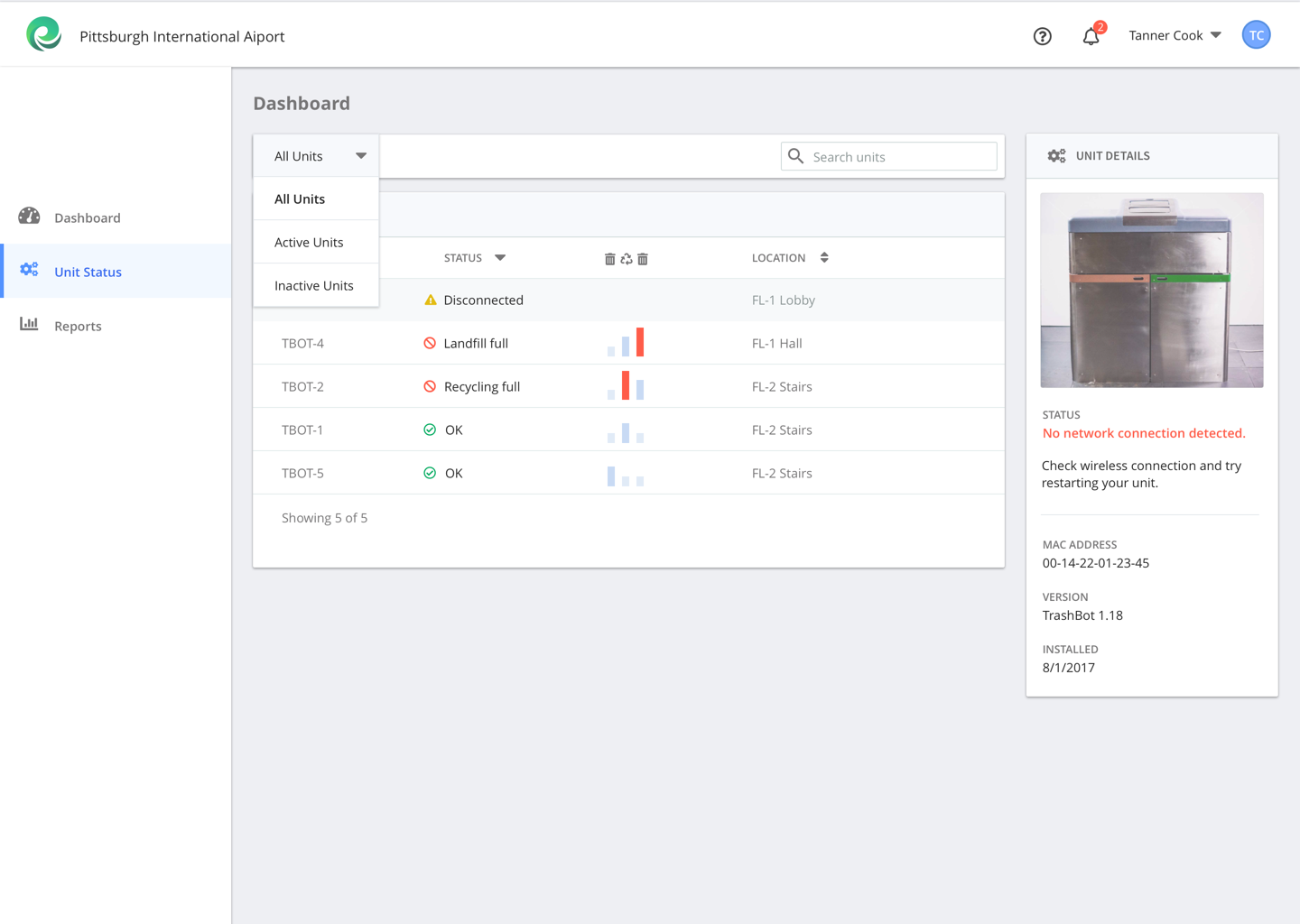
Operations
Users can drill into individual units to diagnose errors and monitor the service status of their machines.
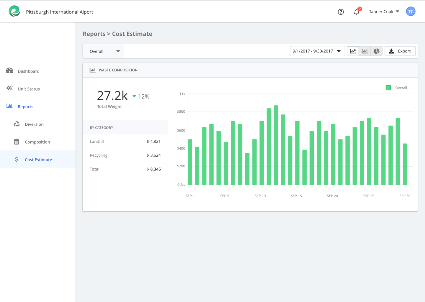
Waste Reports
Users can analyze multiple types of waste data, drilling and filtering by criteria that help waste managers do their job.
Research
Diving into the world of waste data
Being a tiny startup, the team reacted to the idea of doing user research with a bit of skepticism.
How would we fit it into the time and budget that we had? Shouldn't we spend our precious time with customers pitching them the product instead of needling them with questions?
With a bit of persuasion though, the team got on board.
If they were going to spend the time and money to build something, why not take a bit of extra effort to make it sure it'd be a success?

With this in mind, I broke down our research questions into a couple of themes:
1. Mapping workflows and touchpoints with TrashBot
Since part of TrashBot's value proposition was to make life easier for these folks, we had to think carefully about both how the dashboard - and the hardware unit itself - might do so.
2. Defining user needs, usage scenarios, and task flows
Each of these units could capture thousands of data points in a day, but that didn't mean we could throw a wall of numbers at them. In fact, given how busy facilities often are, we'd have to be disciplined about how much data we would even expose to end users.
Research Plan
- Interview CleanRobotics' leadership team for domain knowledge and customer insights
- Conduct market research to understand CleanRobotics' positioning and competitors
- Coordinate on-site contextual interviews an existing customer and two interviews with facilities managers who weren't affiliated with CleanRobotics.
Insights
More data, more problems
TrashBot can collect tons of granular data, but it turned out that facility managers really wanted a streamlined experience, with just enough data to drive day-to-day decision-making.
It forced us to tighten up our understanding of what our users really wanted and draw some lines in the sand about how much data was too much data in the experience.
Designing for physical spaces
The most critical, day-to-day usage scenario for facility managers turned out to be simply checking how their units were doing.
How exactly would a custodian know when a unit was full? For example, could we push updates via text? And, what should a user do if their hardware unit malfunctions?
As TrashBot deployments scale, they'll be placed across different buildings and different floors. They'll potentially even be managed by different facility managers who are responsible for those locations.
We needed to define location metadata for units and users, so they could quickly find the data that's relevant to them.
Design
Goals & Scope
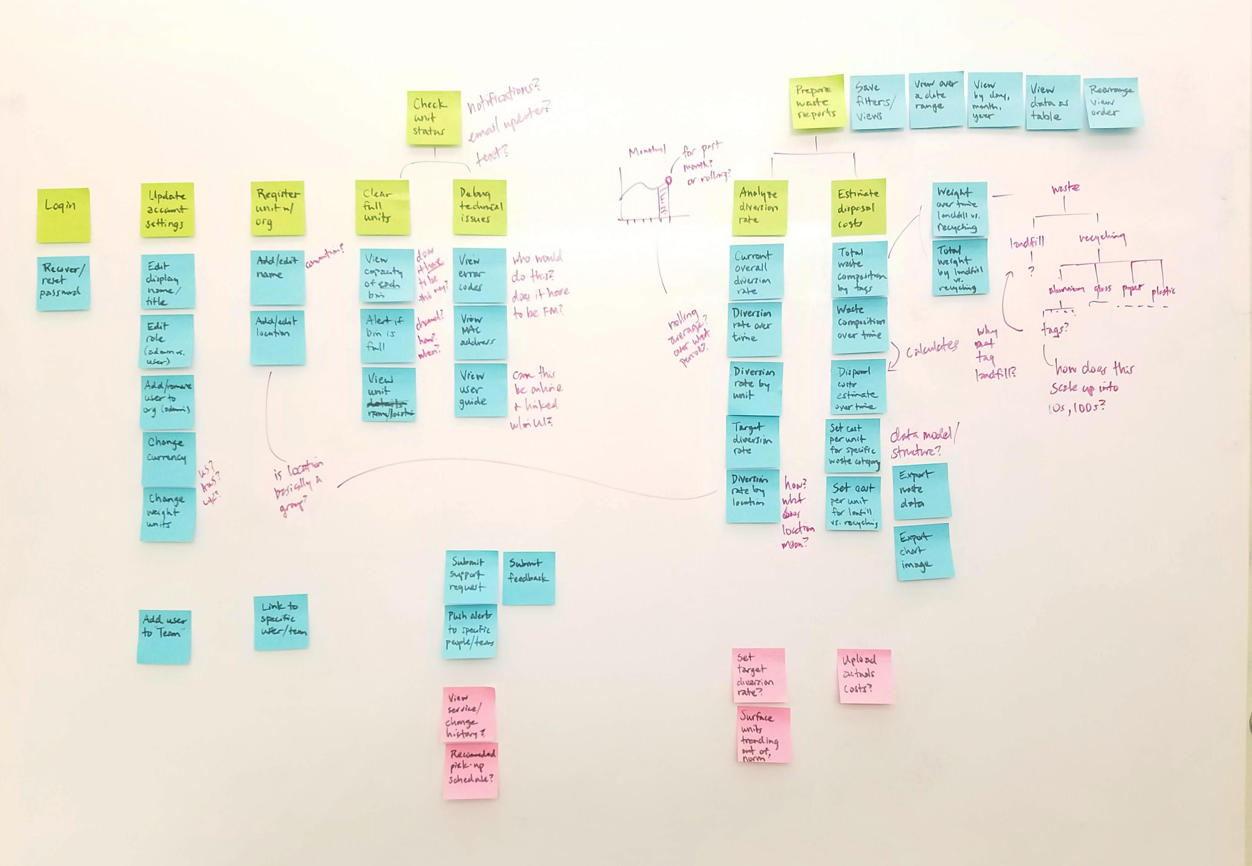
I used story mapping to elicit the key tasks that facility managers would need to do and the features that'd be required to support them.
1. Help facility managers identify and prioritize operational issues as quickly as possible.
2. Elevate the most important metrics, while permitting deeper exploration of the data.
3. Ensure the design can visually and functionally scale from a few TrashBot units to a hundred.
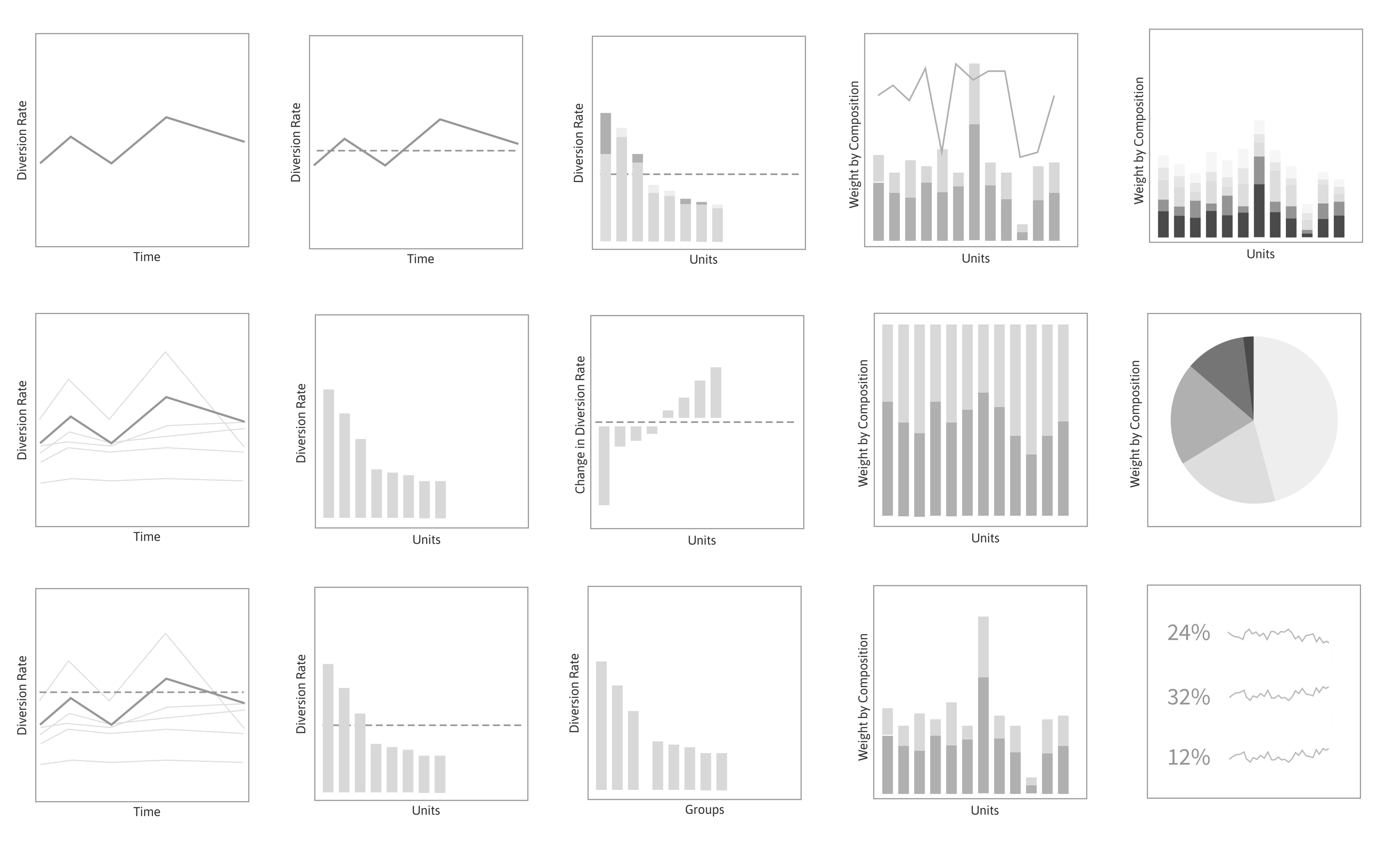
Exploring data visualizations
I sketched out a set of "data visualization cards" for concept testing with the CleanRobotics team and facility managers.
The goal at this stage was to validate which views of the data would be most useful and immediately understandable to a facility manager.
Defining navigation and layout
I sketched out a range of different concepts, convering on an app architecture that would have three sections:
- Dashboard
- Unit Status
- Waste Reports
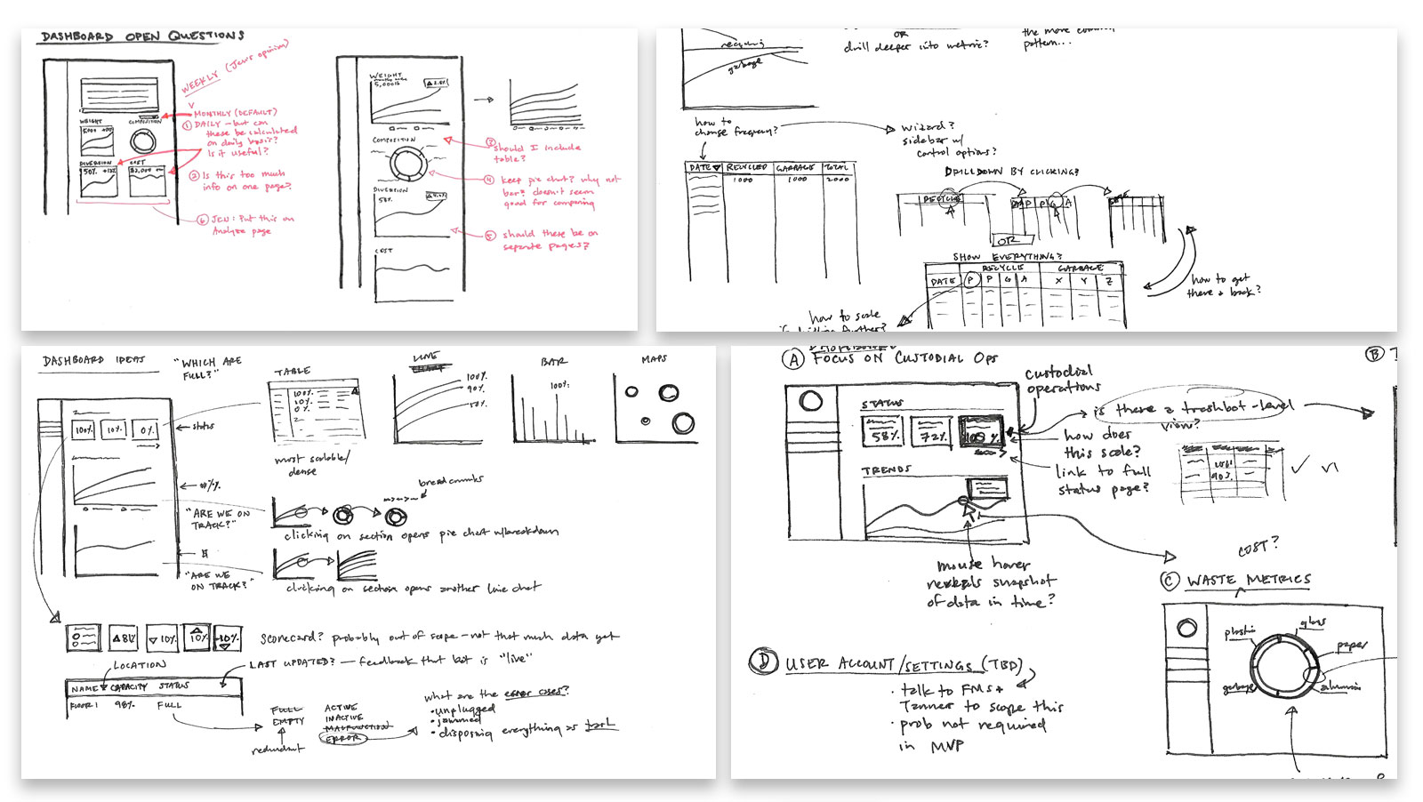
Viewing the Dashboard
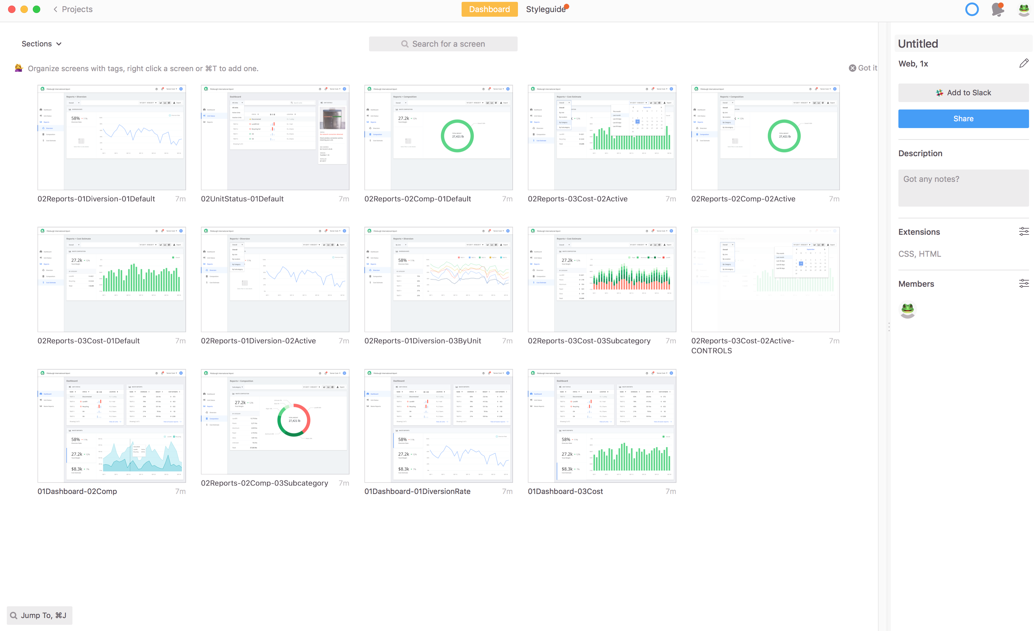
I prototyped a card-based layout for the dashboard, which included both capacity data (i.e. "unit status") and waste data ("waste analysis").
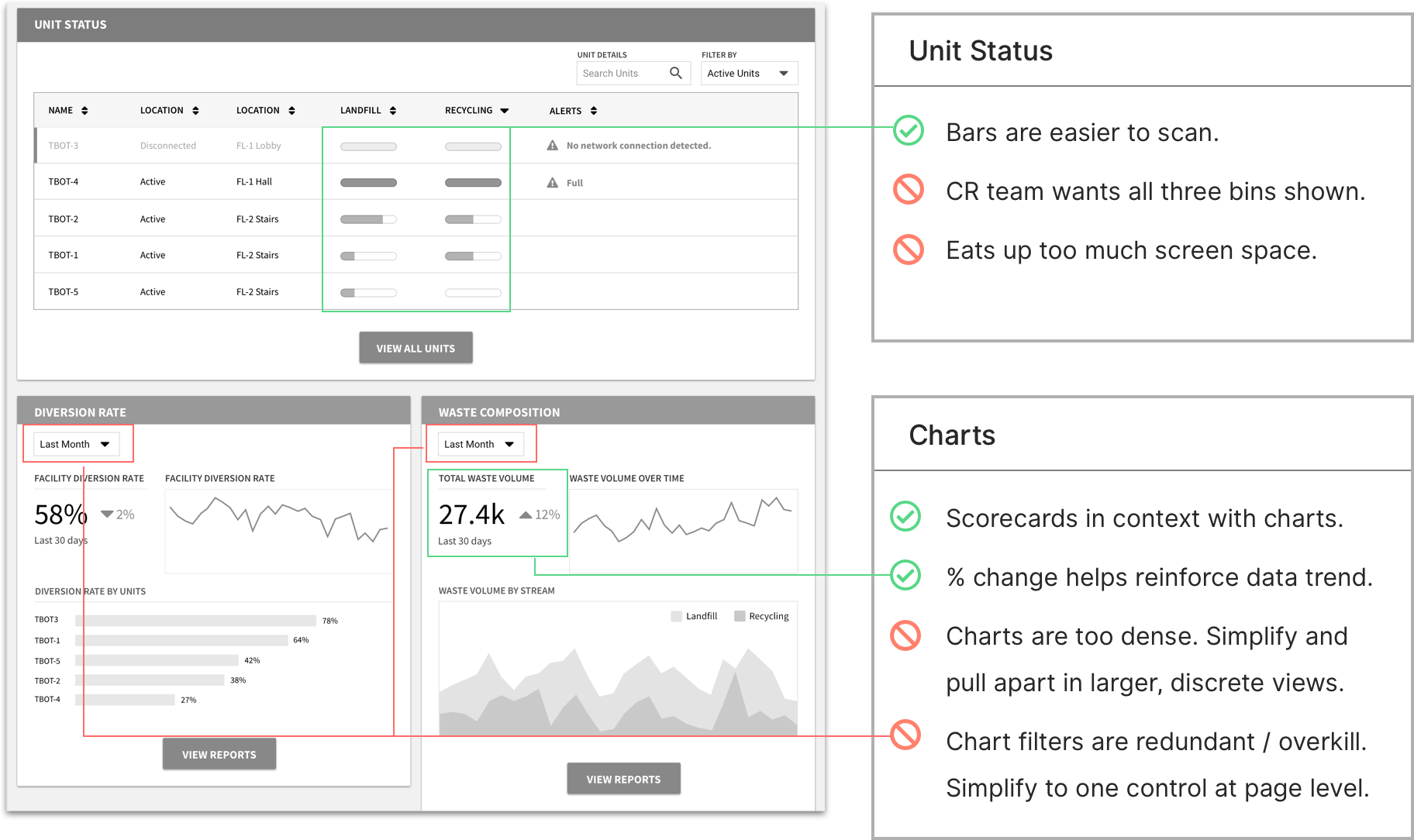
Refining layout and controls
I tightened up what content of each card, paring back unnecessary details. I also explored how to combine scorecards and charts to reinforce the key takeaway for each card.
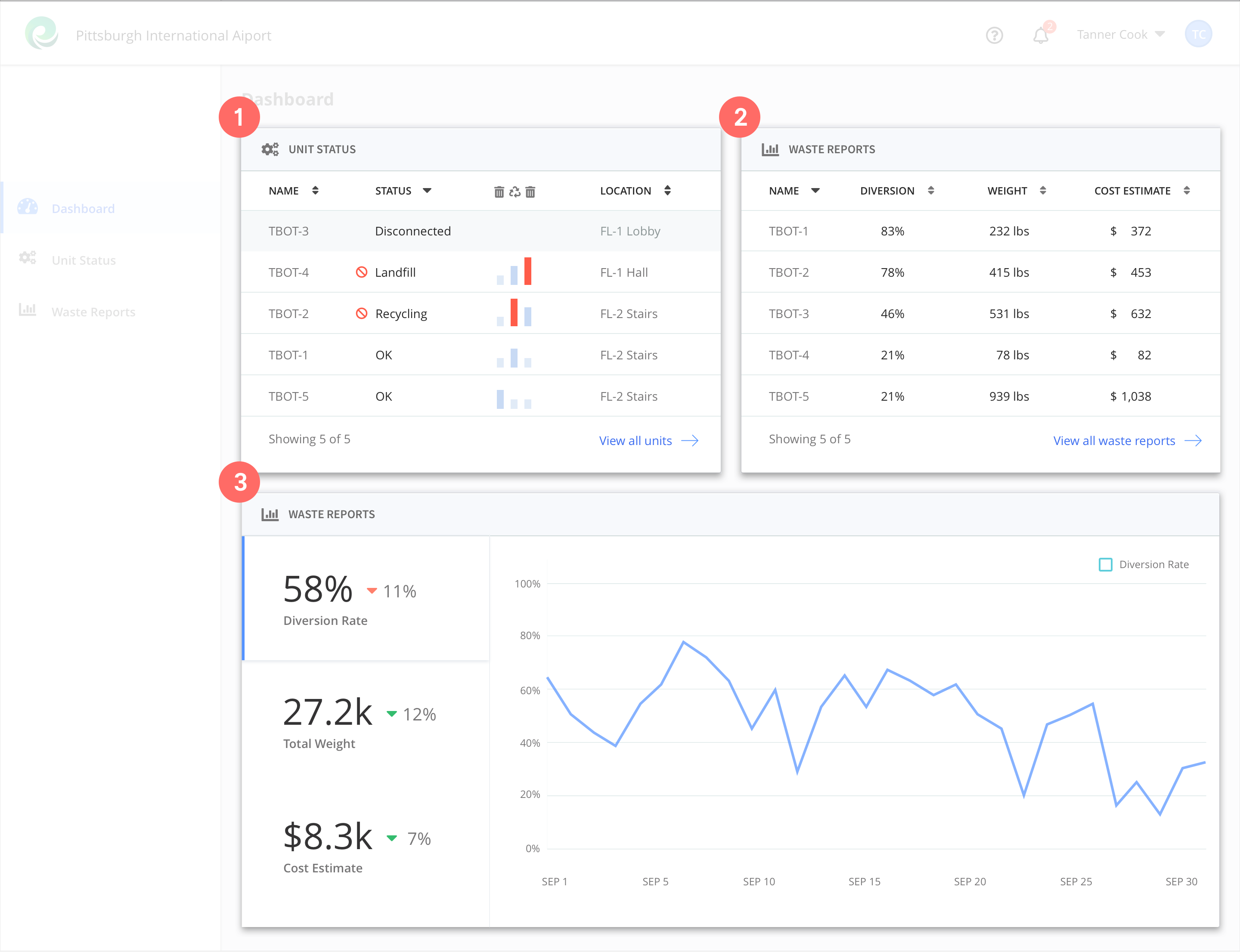
Converging on a final design
I whittled everything down to only the essentials, with every detail supported by a discrete use case from our interviews.
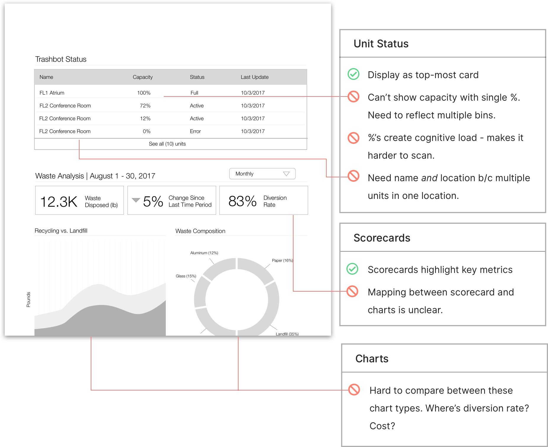
Solving the three bins problem
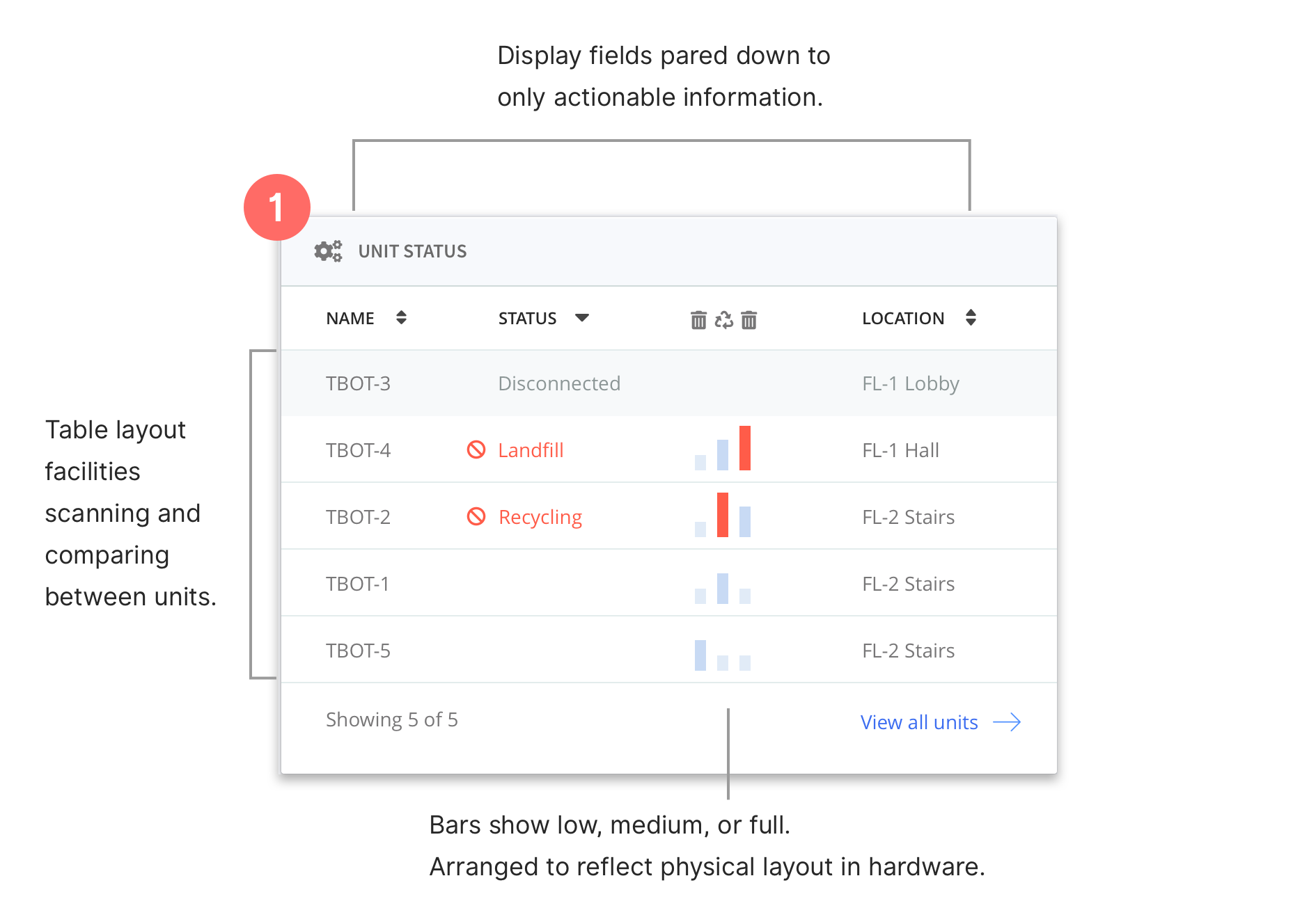
Recall that each unit has three bins, each with its own capacity data.
I realized that they didn't need a detailed breakdown of how much they were full.
I abstracted this data into three vertical bars with a few simple states - low, medium, full. This layout enables a user to scan horizontally down by unit and vertically to get a relative sense of the unit's capacity.
The vertical bars also correspond directly to the physical layout of the waste bins, further cuing users towards which bin needs servicing.
Show me the data
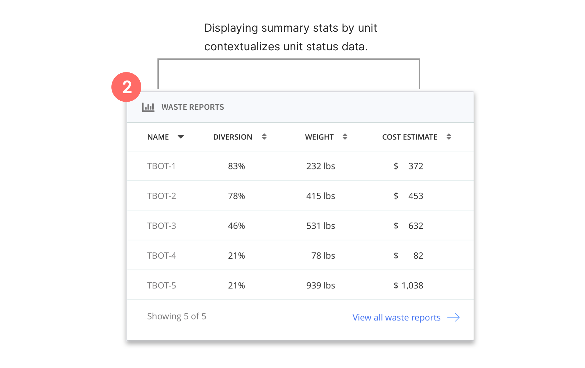
I had originally assumed that facility managers wouldn't need a unit-by-unit breakdown of waste metrics, but it persistently came up as a request because it lends supporting context to the aggregate data.
Waste data in one context
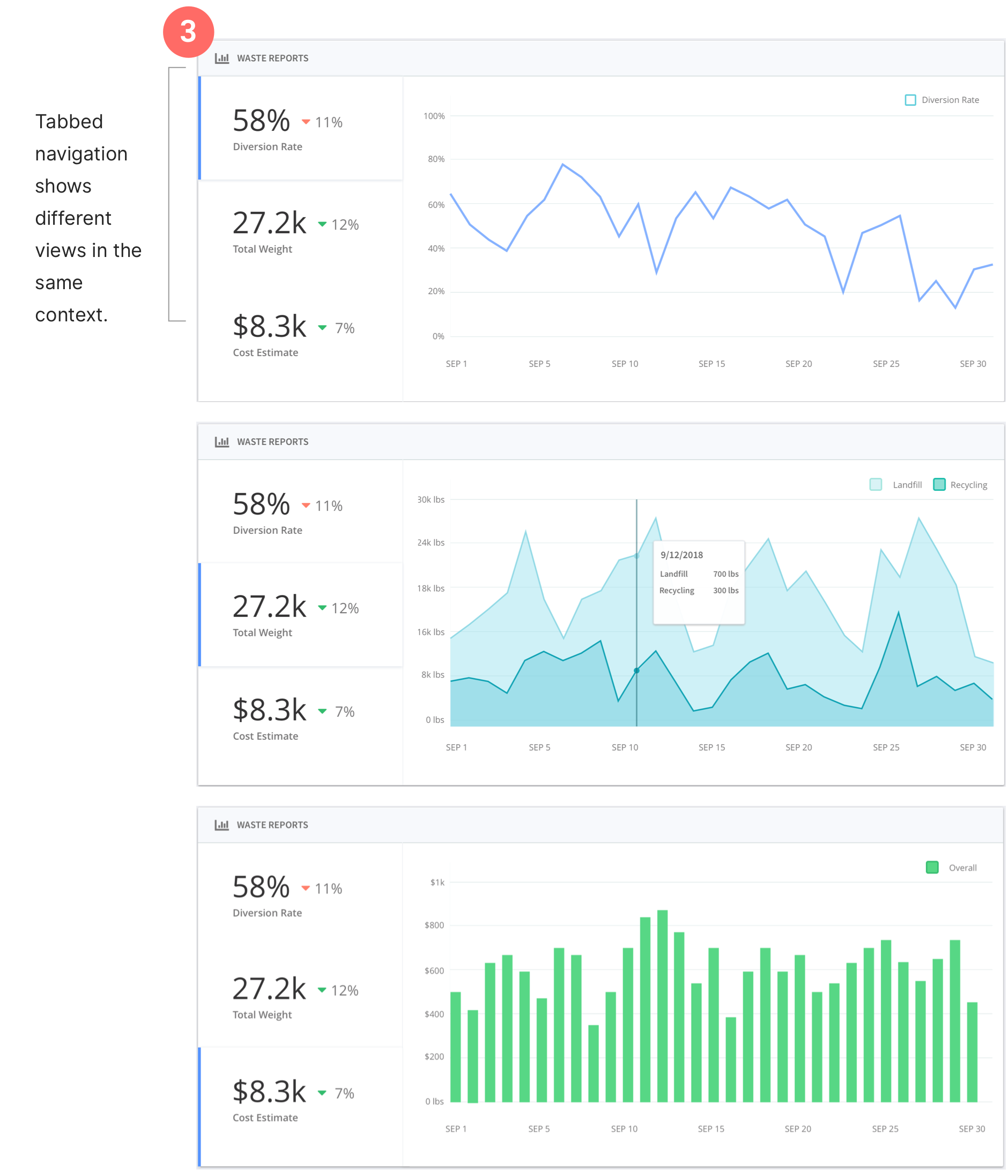
In my earlier iterations, I visually separated Diversion Rate, Waste Composition, and Cost Estimates into three separate views because they felt conceptually different.
However, when I provided users with a general task ("evaluate how your waste program has been over the past couple of weeks"), I noticed them visually scanning back and forth between the three different charts.
I decided to unify these three views into one card with a tabbed navigation, so that users could examine a single chart while easily switching over to another in the same context.
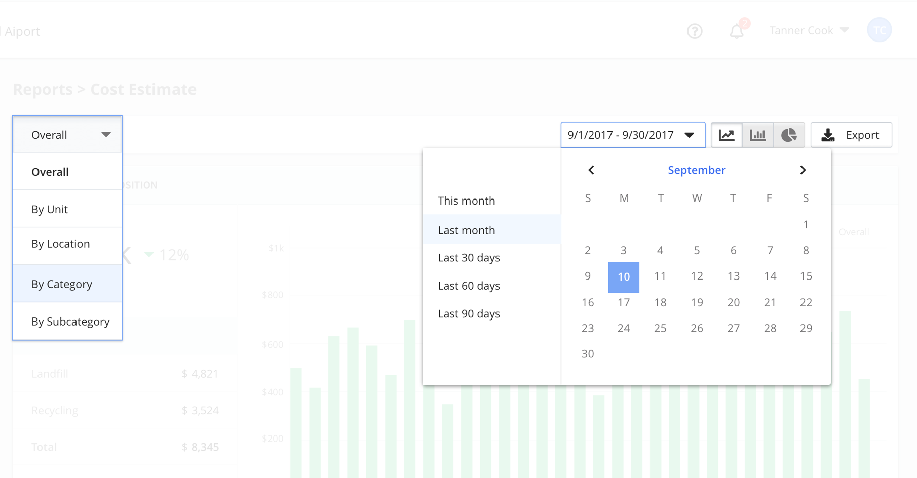
Filtering and sorting data
I designed a simple dropdown for filtering data based on the most common tasks I'd learned about.
Although simple, I also realized that this wouldn't necessarily scale well, as the size and scope of deployments become larger. With more time, I would have explored how to create more robust filtering, grouping and searching experience overall.
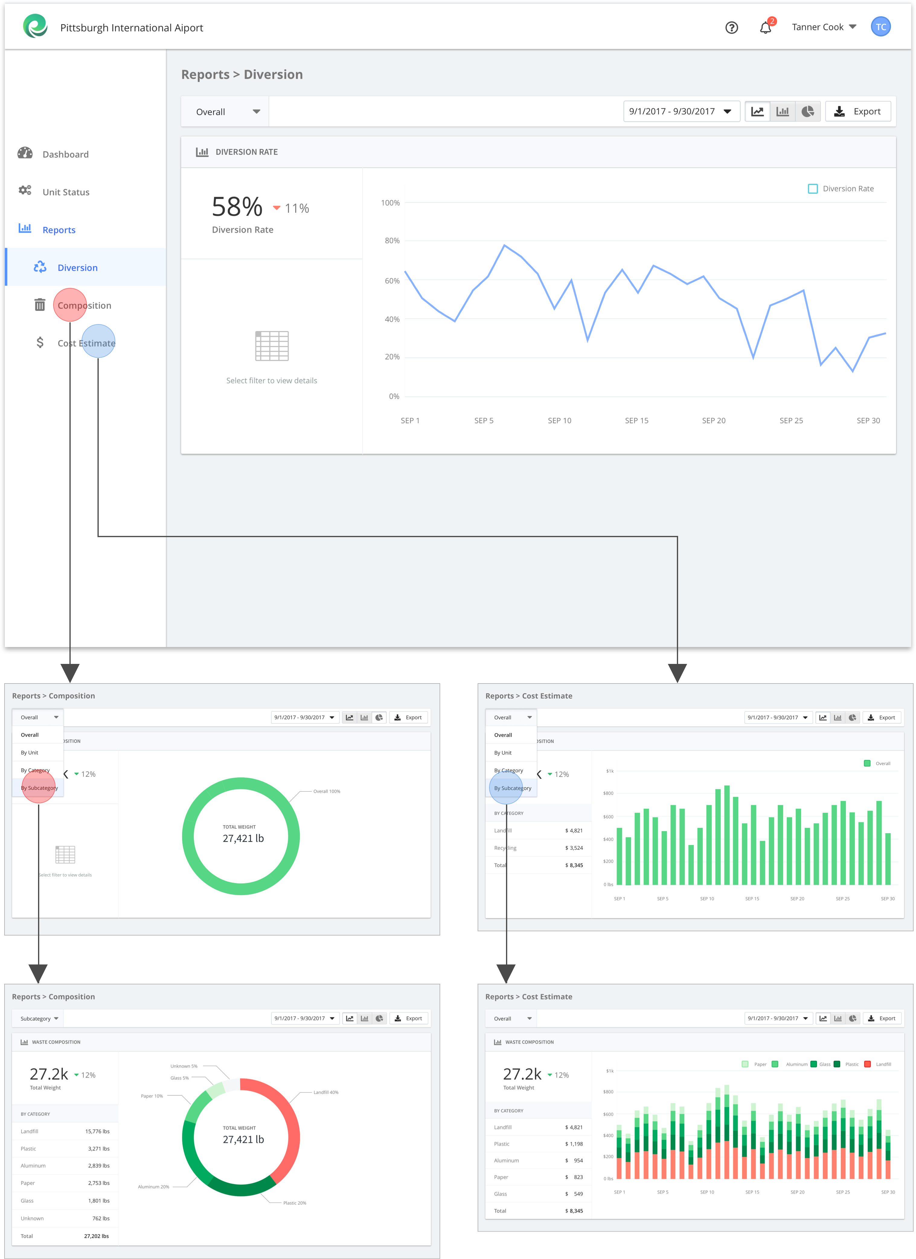
Drilling down into waste reports
In my final usability test, each of the three facility managers were able to accomplish a key task in under 20 seconds (e.g. "Identify which part of their waste stream is contributing the most to your waste costs this month) and rated it at least 4 out of 5 for satisfaction.
Handing off to development
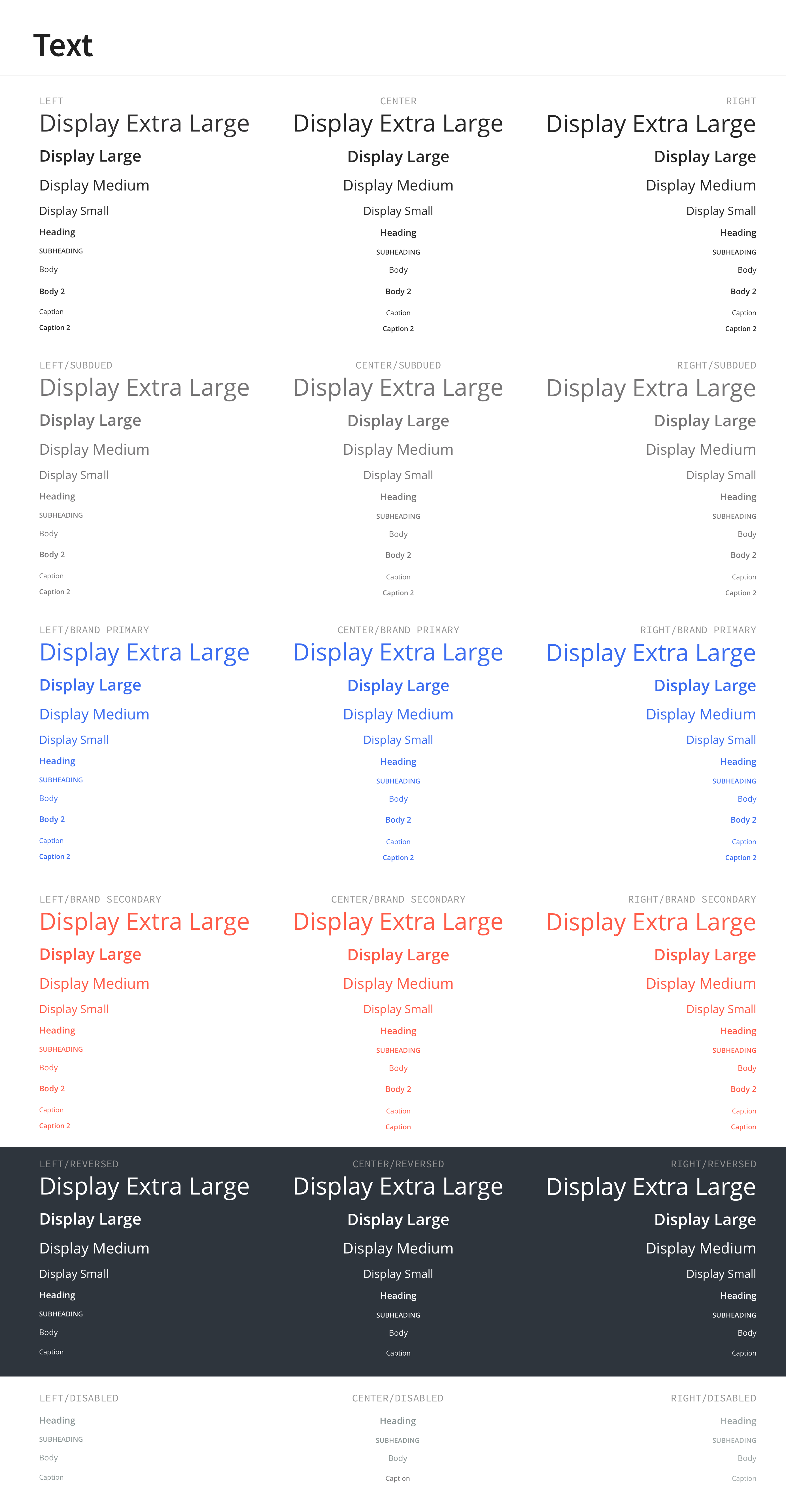
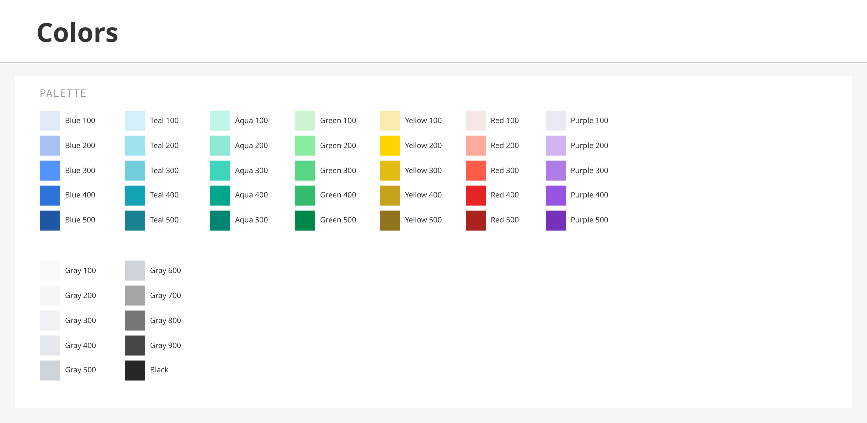
To wrap things, I exported my work to Zeplin with a style guide, including the type system and color palette.
So, what happened next?
The dashboard was shipped to CleanRobotics' customers. The team's gathered qualitative feedback, which has been generally positive.
The team is now primarily focused on improving its hardware product and future iterations of the dashboard will be shaped by the company's evolving product strategy.
Lessons learned
Throughout the project, I felt the push and pull of "too much" vs. "too little." Had warned my past self about this, I probably would've shrugged it off. Isn't it this a pretty simple dashboard? How many ways can you really analyze a pile of garbage sitting in an airport?
As it turns out, a lot. If anything, I learned again the value of solid user research to inform design decisions and wished we could have done more of it. I really didn't have much firsthand access or knowledge to the exact target users we were designing for, so I had to substitute in subject matter experts from the CleanRobotics team.
Luckily, we landed a few interviews at the mid- and endpoints, but we never user tested much of the dashboard design as rigorously as I would've wanted to. If I could rewind time, I'd pushed harder for access and locked in time with their customers as soon as the project again.
Lastly, I'd love to analyze real usage data now that the dashboard's live. Are users actually using the features we built for them? Who are they? Where are they getting stuck? I can't help but wonder how we might improve the product using this type of data.